
I am a very visual person. When looking at data I love to look at the trend of that data and see if it tells a story. If you are using Sentinel, Log Analytics or Azure Data Explorer this can be particularly important. Those platforms can handle an immense amount of data and making sense of it can be overwhelming. Luckily KQL arms us with a lot of different ways to turn our data into visualizations. There are some subtle differences between the capabilities of Azure Monitor (which drives Sentinel) and Azure Data Explorer with visualizations. Check out the guidance here for Azure Data Explorer and here for Azure Monitor (Log Analytics and Sentinel).

In order to produce any kind of visualization in KQL, first we need to summarize our data. I like to separate the styles of visualizations into two main types. First, we have non time visualizations, that is just when we want to produce a count of something and then display it. Secondly, we have time-based visualizations, and that is when we want to visualize our data over a time period. With those we can see how our data changes over time.
Regular Visualizations
For all these examples, we will use our Azure Active Directory sign in logs. That data is full of great information you may want to visualize. Applications, MFA methods, location data, all those and more are stored in our sign in data, and we can use any of them (or combinations of them) as a base for our visuals.
Let’s start simply. We can see the most popular applications in our tenant by doing a simple count. The following query will do that for you.
SigninLogs
| where TimeGenerated > ago(30d)
| where ResultType == 0
| summarize Count=count() by AppDisplayName
Now you will see you are output a table of data.
To turn that into a visualization, we use our render operator. Now you can also do this by clicking in the UI itself on ‘Chart’ and then choosing our options. That isn’t fun though, we want to learn how to do it ourselves. It is also simple; we just need to tell KQL what type of visual we want. To build a standard pie chart we just add one more line to our query.
SigninLogs
| where TimeGenerated > ago(30d)
| where ResultType == 0
| summarize Count=count() by AppDisplayName
| render piechart 
With these kind of counts in order to make them display a little ‘cleaner’, I would recommend ordering them first. That way they will display consistently. Depending on how much data you have, you may also want to limit the results. Otherwise, you may just have too many results in there and it becomes hard to read. We can achieve both of those by adding a single line to our query. We tell KQL to take the top 10 results by the count. Then again render our pie chart.
SigninLogs
| where TimeGenerated > ago(30d)
| where ResultType == 0
| summarize Count=count() by AppDisplayName
| top 10 by Count
| render piechart 
In my opinion this cut down version is much easier to make sense of. If you don’t want to use a pie chart, you can use bar or column charts too. Depending on your data, you may want to pick one over the other. I personally find column and bar charts are a little easier to understand than pie charts. They are also better at giving context because they show the scale a little better.
We can see the same query visualized as a bar chart.
SigninLogs
| where TimeGenerated > ago(30d)
| where ResultType == 0
| summarize Count=count() by AppDisplayName
| where isnotempty( AppDisplayName)
| top 10 by Count
| render barchart 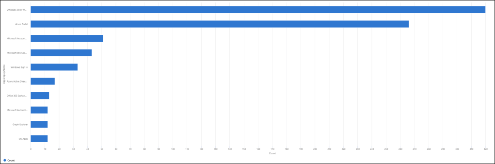
And a column chart.
SigninLogs
| where TimeGenerated > ago(30d)
| where ResultType == 0
| summarize Count=count() by AppDisplayName
| where isnotempty( AppDisplayName)
| top 10 by Count
| render columnchart 
In these examples we can really see the different between our top 2 results, and everything else. Some other examples you may find useful in your Azure AD logs are single vs multifactor authentication requirement on sign in.
SigninLogs
| where TimeGenerated > ago(30d)
| where ResultType == 0
| summarize Count=count() by AuthenticationRequirement
| render piechart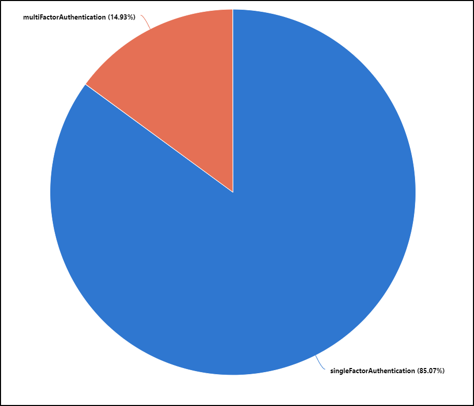
We can dig even deeper and look at types of MFA being used.
SigninLogs
| where TimeGenerated > ago(150d)
| where AuthenticationRequirement == "multiFactorAuthentication"
| mv-expand todynamic(AuthenticationDetails)
| extend ['Authentication Method'] = tostring(AuthenticationDetails.authenticationMethod)
| where ['Authentication Method'] !in ("Password","Previously satisfied")
| summarize Count=count()by ['Authentication Method']
| where isnotempty(['Authentication Method'])
| sort by Count desc
| render piechartThis would show you the breakdown of the different MFA types in your tenant such as mobile app notification, text message, phone call, Windows Hello for Business etc.
You can even see the different locations accessing your Azure AD tenant.
SigninLogs
| where TimeGenerated > ago(30d)
| where ResultType == 0
| summarize Count=count() by Location
| top 10 by Count
| render columnchart
Have a play with the different types to see which works best for you. Pie charts can be better when you have fewer types of results. For instance, the single vs multifactor authentication pie chart really tells you a great story about MFA coverage in this tenant.
Time series visualizations
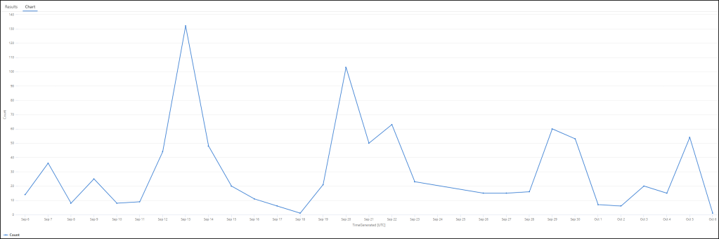
Time series visualizations build on that same work, though this time we need to add a time bucket or bin to our data summation. Which makes sense if you think about it. To tell KQL to visualize something over a time period, we need to put our data into bins of time. So then when it displays, we can see how it looks over a long time period. We can choose what size we want those bins to be. Maybe we want to look at 30 days of data total, then break that into one day bins. Let’s start basic again, and just look at total successful sign ins to our tenant per day over the last 30.
SigninLogs
| where TimeGenerated > ago(30d)
| where ResultType == 0
| summarize Count=count() by bin(TimeGenerated, 1d)
| render timechart
We can see in our query we are looking back 30 days, then we are putting our results into 1-day bins of time. Our resulting visual shows how that data looks over the period.
If you wanted to reduce the time period of each bin, you can. You could reduce the bin time down to say 4 hours, or 30 minutes. Here is the same data, but with 4-hour time bins instead of 1 day.
SigninLogs
| where TimeGenerated > ago(30d)
| where ResultType == 0
| summarize Count=count() by bin(TimeGenerated, 4h)
| render timechart 
There are no more or less sign ins to our tenant, we are just sampling the data more frequently to build our visual.
You can even use more advanced data aggregation and summation before your visual. You can for instance take a count of both the total sign ins and the distinct user sign ins and visualize both together. We then query both over the same 4-hour time period and can see both on the same visual.
SigninLogs
| where TimeGenerated > ago(30d)
| where ResultType == 0
| summarize Count=count(), ['Distinct Count']=dcount(UserPrincipalName) by bin(TimeGenerated, 4h)
| render timechart 
Now we can see total sign ins in blue and distinct user sign ins in orange, over the same time period. Another great example is using countif(). For instance, we can maybe look at sign ins from the US vs those not in the US. We do a countif where the location equals US and again for when it doesn’t equal the US.
SigninLogs
| where TimeGenerated > ago(30d)
| where ResultType == 0
| summarize US=countif(Location == "US"), NonUS=countif(Location != "US") by bin(TimeGenerated, 4h)
| render timechart 
Again, we see the breakdown in our visual.
We can still use bar charts with time-series data as well. This can be a really great way to show changes or anomalies in your data. Take for instance our single factor vs multifactor query again. This time though we will group the data into 1-day bins. Then render them as a column chart.
SigninLogs
| where TimeGenerated > ago(30d)
| where ResultType == 0
| summarize Count=count() by AuthenticationRequirement, bin(TimeGenerated, 1d)
| render columnchart 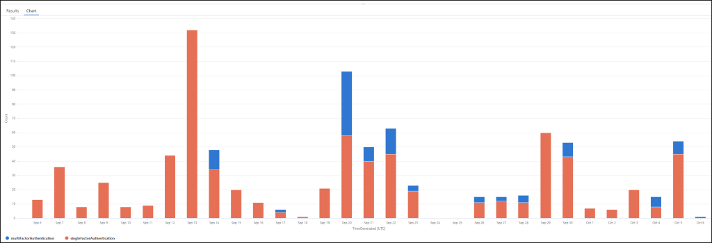
The default behaviour with column charts is for KQL to ‘stack’ the columns into a single column per time period (1-day in this example). We can tell KQL to unstack them though so that we get a column for each result, on every day.
SigninLogs
| where TimeGenerated > ago(30d)
| where ResultType == 0
| summarize Count=count() by AuthenticationRequirement, bin(TimeGenerated, 1d)
| render columnchart with (kind=unstacked)
We see the same data, just presented differently. Unstacked column charts can have a really great visual impact.
Summarize vs make-series
For time queries, KQL has a second, similar operator called make-series. When we use summarize and there are no results in that particular time period, then there is simply no record for that particular time ‘bin’. This can have the effect of your visuals tending to be a little ‘smoother’ over periods where you did have results. If you use make-series, we can tell KQL to default to 0 when there are no hits, making the visual more ‘accurate’. Take for example our regular successful Azure AD signs. Our summarize query and visual looks like this.
SigninLogs
| where TimeGenerated > ago(30d)
| where ResultType == 0
| summarize Count=count() by bin(TimeGenerated, 4h)
| render timechart 
This is the equivalent query with make-series. We tell KQL to default to 0 and to use a time increment (or step) of 4 hours.
SigninLogs
| where TimeGenerated > ago(30d)
| where ResultType == 0
| make-series Count=count() default=0 on TimeGenerated step 4h
| render timechart
And our resulting visual.
You can see the difference in those times where there was no sign ins. From September 24th to 26th the line is at zero on the make-series version. On the summarize version it moves between the two points where there were results.
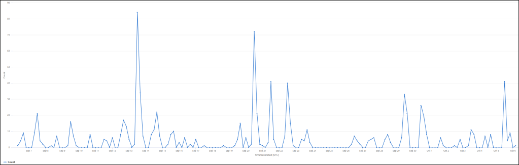
Make-series has some additional capability, allowing true time-series analysis. For example, you can overlay a trend line over your series. For example. looking at conditional access failures to our tenant may be interesting. We can search for error code 53003 and then overlay a trend to our visual.
SigninLogs
| where TimeGenerated > ago(30d)
| where ResultType != "53003"
| make-series Count=count() default=0 on TimeGenerated step 1d
| extend (RSquare, SplitIdx, Variance, RVariance, TrendLine)=series_fit_2lines(Count)
| project TimeGenerated, Count, TrendLine
| render timechart 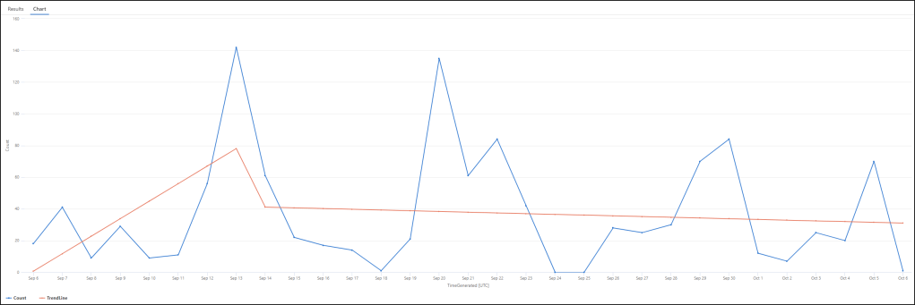
Now we can see our orange trend as well as the actual count. Trend information may be interesting for things like MFA and passwordless usage or tracking usage of a particular application. Simply write your query first like normal, then apply the trend line over the top.
Cleaning up your visuals
To make your visuals really shine you can even tidy up things like axis names and titles within your query. Using our last example, we can add new axis titles and a title to the whole visual. We call our y-axis “Failure Count”, the x-axis “Day” and the whole visual “Conditional access failures with trend over time”.
SigninLogs
| where TimeGenerated > ago(30d)
| where ResultType != "53003"
| make-series Count=count() default=0 on TimeGenerated step 1d
| extend (RSquare, SplitIdx, Variance, RVariance, TrendLine)=series_fit_2lines(Count)
| project TimeGenerated, Count, TrendLine
| render timechart with (xtitle="Day", ytitle="Failure Count", title="Conditional access failures with trend over time")
You can also adjust the y-axis scale. For example, if you ran our previous query and saw the results. You may have thought ‘these are pretty low, but if someone was to look at this visual, they will see the peaks and worry’. Even though the peaks themselves are relatively low. To counter that you can extend the y-axis, by setting a manual max limit. For instance, let’s set it to 400.
SigninLogs
| where TimeGenerated > ago(30d)
| where ResultType != "53003"
| make-series Count=count() default=0 on TimeGenerated step 1d
| extend (RSquare, SplitIdx, Variance, RVariance, TrendLine)=series_fit_2lines(Count)
| project TimeGenerated, Count, TrendLine
| render timechart with (xtitle="Day", ytitle="Failure Count", title="Conditional access failures with trend over time",ymax=400)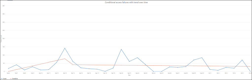
We can see that our scale changes and maybe it better tells our story.
Within your environment there are so many great datasets to draw inspiration from to visualize. You can use them to search for anomalies from a threat hunting point of view. They can also be good for showing progress in projects. If you’re enabling MFA then check your logs and visualize how that journey is going.
Have a read of the guidance for the render operator. There are additional visualization options available. Also just be aware of the capability differences between both the platform – Azure Data Explorer vs Azure Monitor, and the agent you are using. The full Kusto agent has additional capabilities over the web apps.
Additional Links
Render operator for Azure Data Explorer – https://learn.microsoft.com/en-us/azure/data-explorer/kusto/query/renderoperator?pivots=azuredataexplorer
Render operator for Azure Monitor (Sentinel and Log Analytics) – https://learn.microsoft.com/en-us/azure/data-explorer/kusto/query/renderoperator?pivots=azuremonitor
Kusto Explorer – https://learn.microsoft.com/en-us/azure/data-explorer/kusto/tools/kusto-explorer
Additional example queries here – https://github.com/reprise99/Sentinel-Queries

One thought on “A picture is worth a thousand words – visualizing your data.”
1 Pingback